Print Design
Luck For 99 Cents
Luck For 99 Cents
Luck For 99 Cents
Year
Scope
Industry
Year
Scope
Industry
2025
Print Design
Cultural
2025
Cultural
A 40-page, double-sided accordion booklet that investigates diasporic spaces through typography observed in Vancouver’s Chinatown, Richmond, and Coquitlam.
A 40-page, double-sided accordion booklet that investigates diasporic spaces through typography observed in Vancouver’s Chinatown, Richmond, and Coquitlam.
A 40-page, double-sided accordion booklet that investigates diasporic spaces through typography observed in Vancouver’s Chinatown, Richmond, and Coquitlam.

Luck for 99 Cents is a 40-page, double-sided accordion booklet that investigates diasporic spaces through typography observed in Vancouver’s Chinatown, Richmond, and Coquitlam. It is structured as a flyer-like publication. The project draws from an archive of over 750 photographs documenting signage, packaging, storefronts, and advertisements found in everyday environments. It's a project designed to draw your attention to the typography that surrounds you, while highlighting the Chinese-Canadian experience. English and Chinese characters are laid out together to create a bold and colourful experience.
INSIGHT
Luck for 99 Cents is a 40-page, double-sided accordion booklet that investigates diasporic spaces through typography observed in Vancouver’s Chinatown, Richmond, and Coquitlam. It is structured as a flyer-like publication. The project draws from an archive of over 750 photographs documenting signage, packaging, storefronts, and advertisements found in everyday environments. It's a project designed to draw your attention to the typography that surrounds you, while highlighting the Chinese-Canadian experience. English and Chinese characters are laid out together to create a bold and colourful experience.
Luck for 99 Cents is a 40-page, double-sided accordion booklet that investigates diasporic spaces through typography observed in Vancouver’s Chinatown, Richmond, and Coquitlam. It is structured as a flyer-like publication. The project draws from an archive of over 750 photographs documenting signage, packaging, storefronts, and advertisements found in everyday environments. It's a project designed to draw your attention to the typography that surrounds you, while highlighting the Chinese-Canadian experience. English and Chinese characters are laid out together to create a bold and colourful experience.

Accordion Printed Mockup
Accordion Printed Mockup
Accordion Printed Mockup

Accordion Printed Mockup
Accordion Printed Mockup
Accordion Printed Mockup

SOLUTION
SOLUTION
Rooted in my experience as a Chinese-Canadian who grew up without fluency in Mandarin or Cantonese. I wanted to tackle the idea of "bad design," which I usually associated with Chinese grocery store flyers and loud graphics. I found that these designs were more intentional than I thought. Many of the environments I visited, use design that could be labelled as “outdated,” “busy,” or “incorrect” within design standards. However, these approaches have a nostalgic charm and sense of urgency. Luck for 99 Cents challenges “bad design” by evaluating typography within its cultural context, rather than dominant design standards or aesthetics.
Rooted in my experience as a Chinese-Canadian who grew up without fluency in Mandarin or Cantonese. I wanted to tackle the idea of "bad design," which I usually associated with Chinese grocery store flyers and loud graphics. I found that these designs were more intentional than I thought. Many of the environments I visited, use design that could be labelled as “outdated,” “busy,” or “incorrect” within design standards. However, these approaches have a nostalgic charm and sense of urgency. Luck for 99 Cents challenges “bad design” by evaluating typography within its cultural context, rather than dominant design standards or aesthetics.
Rooted in my experience as a Chinese-Canadian who grew up without fluency in Mandarin or Cantonese. I wanted to tackle the idea of "bad design," which I usually associated with Chinese grocery store flyers and loud graphics. I found that these designs were more intentional than I thought. Many of the environments I visited, use design that could be labelled as “outdated,” “busy,” or “incorrect” within design standards. However, these approaches have a nostalgic charm and sense of urgency. Luck for 99 Cents challenges “bad design” by evaluating typography within its cultural context, rather than dominant design standards or aesthetics.

Sketch -> Translation -> Design
Sketch -> Translation -> Design
Sketch -> Translation -> Design

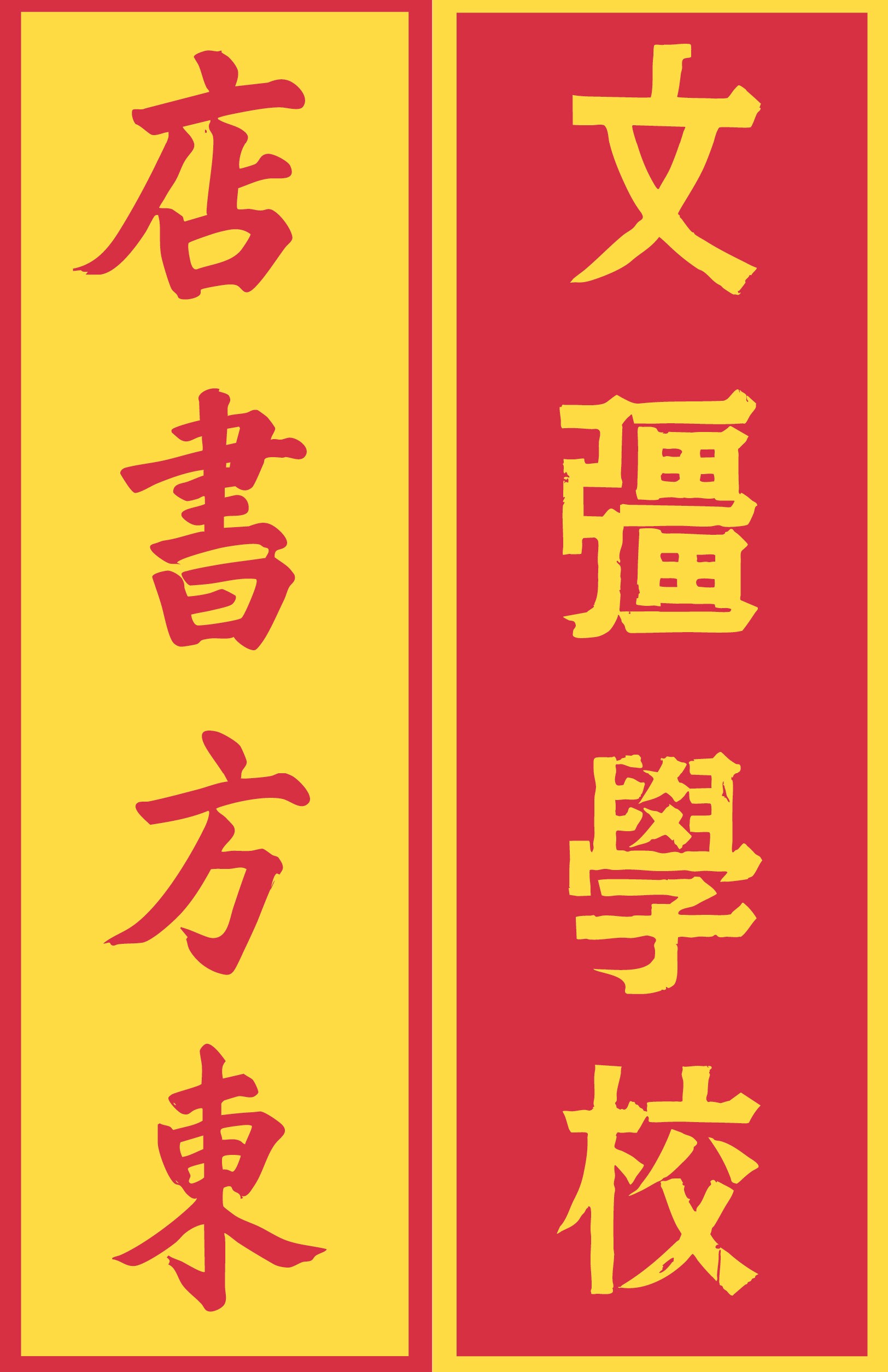
Typography from photography -> Design Outcome
Typography from photography -> Design Outcome
Typography from photography -> Design Outcome
Typography from photography -> Design Outcome

EXECUTION
Photography was taken in Coquitlam, Richmond, and Vancouver to capture pockets of Chinese-Canadian communities. More than 750 photographs were taken throughout the project to capture the wide range of written and commercial typography used. Luck for 99 Cents operates as a booklet and typographic archive, translating field research into a visual system. It highlights how everyday design can reveal complex relationships between culture, language, and identity. By centring typography, the project challenges dominant definitions of “good” design, documents a cultural context, and reflects on the experience of diasporic identity. Ultimately, the work suggests that typography is not just a tool for communication but a carrier of memory and culture.
Photography was taken in Coquitlam, Richmond, and Vancouver to capture pockets of Chinese-Canadian communities. More than 750 photographs were taken throughout the project to capture the wide range of written and commercial typography used. Luck for 99 Cents operates as a booklet and typographic archive, translating field research into a visual system. It highlights how everyday design can reveal complex relationships between culture, language, and identity. By centring typography, the project challenges dominant definitions of “good” design, documents a cultural context, and reflects on the experience of diasporic identity. Ultimately, the work suggests that typography is not just a tool for communication but a carrier of memory and culture.
Photography was taken in Coquitlam, Richmond, and Vancouver to capture pockets of Chinese-Canadian communities. More than 750 photographs were taken throughout the project to capture the wide range of written and commercial typography used. Luck for 99 Cents operates as a booklet and typographic archive, translating field research into a visual system. It highlights how everyday design can reveal complex relationships between culture, language, and identity. By centring typography, the project challenges dominant definitions of “good” design, documents a cultural context, and reflects on the experience of diasporic identity. Ultimately, the work suggests that typography is not just a tool for communication but a carrier of memory and culture.

Richmond Public Market
Richmond Public Market
Richmond Public Market

Richmond Public Market
Richmond Public Market







Next
Next
